GrubHub User Research
The purpose of this study is to analyze and improve the user experience when using the GrubHub mobile application by updating the restaurant browsing experience, providing a quick way to view menus and add more user friendly options to search and filter for different cuisines.
These strategic recommendations is based on user research are for the individual who lives a busy lifestyle and does not have the means to always provide for themself, but enjoys fast and quality meals.
Executive Summary
Methodology
User Observation
+ Testing
The goal of this study was to improve the food delivery app, GrubHub by enhancing customer selection within the app, satisfaction in delivery time, and ease of navigation.
With various other competitors on the market, deciding whether or not to use GrubHub was a toss up between users. While browsing the menu items, 60% of the tested users had difficulty sorting through the app due to too many available options and lack of whitespace. Once orders were added to the cart, some users had difficulty customizing their choices. Relief came after the order was placed and they received minimal tracking information. Users found that they were more productive with their time now that their food was being provided for them. 85% of users were glad they decided to use GrubHub, and would be more likely to order in the future with promo codes.
In this study, we collected data from 9 different participants. Heuristics used include: Aesthetic and minimalist design, flexibility and efficiency of use, user control and freedom, error prevention, visibility of systems, and help and documentation.
Users were asked to go through the entire beginning to end process of using and order from GrubHub. This included planning to use the app, sorting through the various restaurants, verifying order items, tracking the order once in transit, and assessing their experience post-delivery.
The data that was collected includes a range of their actions, thoughts, emotions, and future opportunities.
The common issue found among all users:
1. Restaurant browsing experience
2. Scan-ability of the menu
3. Lack of filters

Discoveries
Summary of Findings
🤔 Users had a difficult time navigating the app. With clutter and lack of whitespace, there were challenges to easily identify some of the headers, breadcrumbs, and colors
🆘 Overwhelming amount of options to choose from, limited help available
🚀 Users used the time waiting for food to arrive to be more productive in their person lives
🍽️₊Users enjoyed being able to customize select food items
❌ Once the order was place, there is a lack of tracking ability
Clutter + Lack of White Space

Tracking

Too Many Options

Customization
Detailed Results
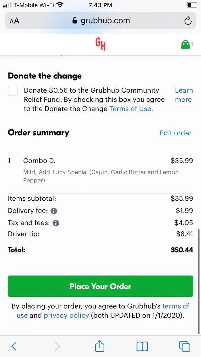
Additional Fees
The delivery fees, taxes, and tip, in addition to the marked-up menu items, deterred 40% of users from wanting to place an order
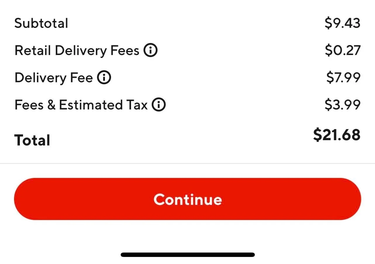
90% of users said they were more likely to use GrubHub if it was closer in price to ordering in person or they were given promo codes
Strategic Recommendations
UX Research Case Study
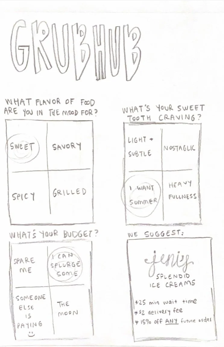
“For You Menu”
Food quiz to assist users for when they cannot decide / feel overwhelmed with the multiple options. This would be broken into different categories based on distance, price range, and variety of food. Restaurants would be given the opportunity to partner with GrubHub for promoted items. This would be on a side tab, not required to place an order.